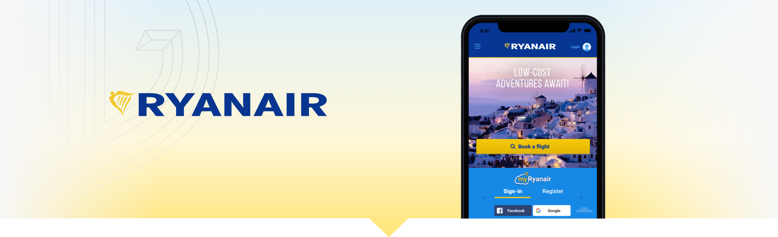
RYANAIR MOBILE APP
The Problem:
As a low-budget carrier, the company has historically relied on the notion that their customers ultimately overlook no-frills accommodations for the lowest ticket prices, however this ethos has left the company with a negative public image. In conjunction with its Always Getting Better (AGB) campaign, Ryanair has identified its customer app as an integral interface for driving ticket sales while improving its customer image. Being an uphill battle, how can Ryanair increase customer satisfaction when perception of the brand is fairly negative overall.
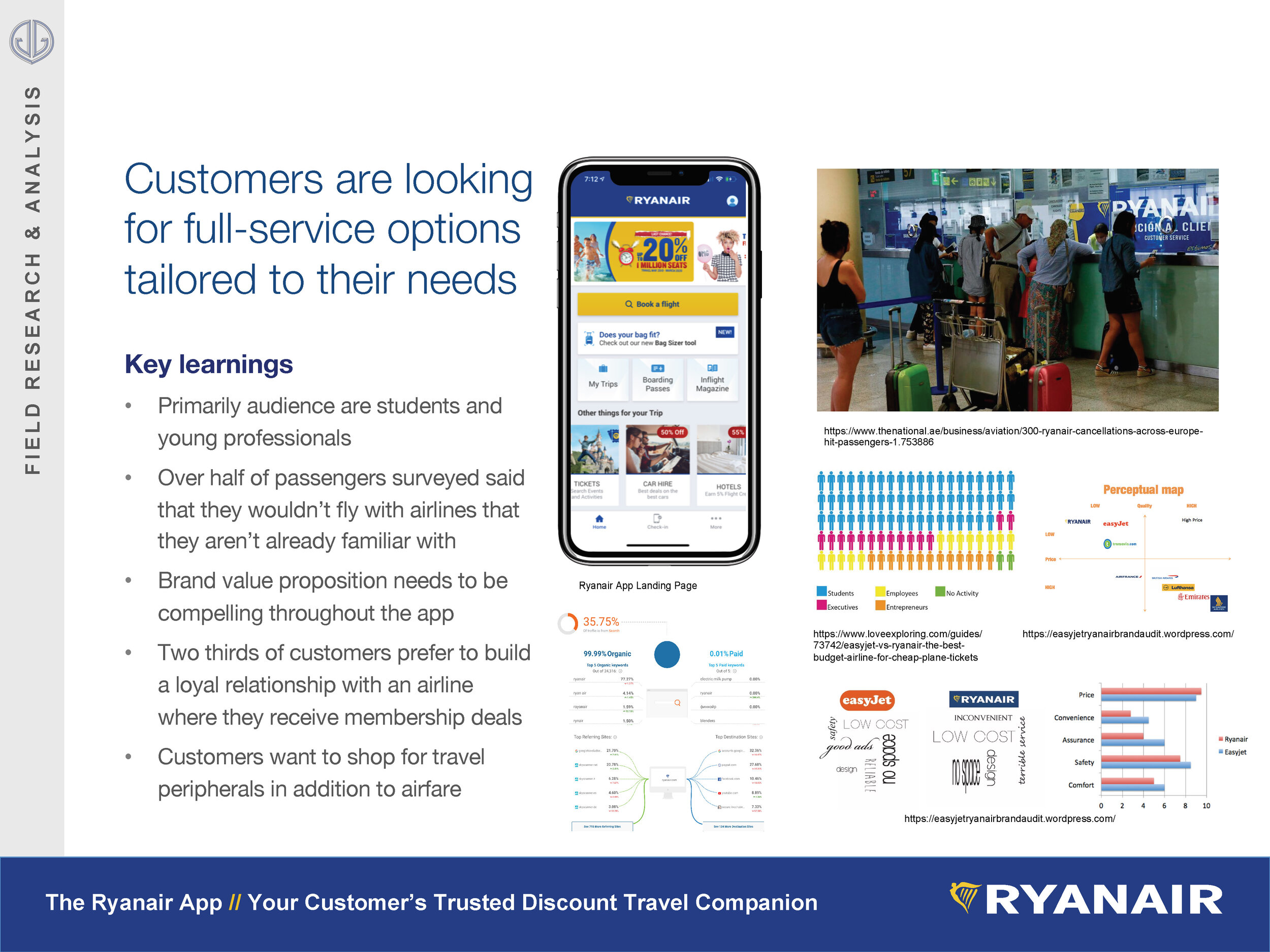
Our team found that relying primarily on low-ticket prices is an unsustainable for customer retention strategy. Based on field analysis customers are increasingly looking for one-stop-shop travel carriers that are tailored to their interests and needs.Ryanair customers are frequently disappointed with the lack of quality customer service, informational relevance and price transparency that would otherwise motivate them to be loyal customers.
Design Team:
I worked independently on this project on all aspects from discovery, to analysis, ideation, prototyping and testing.
What tools you used:
Desk research of the field, Google based surveys, In-person interviews, UX Pressia, Persona Generator, Sketch, Invision, Powerpoint
Discovery phases:
Conducted Nielson’s usability model heuristics of the app
Competitive brand analysis
User interviews
User surveys
Researched airline industry white paper
Sourced customer demographics
Analysis and Design:
Built customer personas journey maps
Prioritized user stories
Rapid Sketches
Lo-hi wireframes and prototypes
Usability Testing
The final outcome
During usability testing of the prototype, I learned that users want as much booking information upfront with transparent pricing options a long the way. Departing away from the current apps advertising model would make the app experience much more inviting for customers and more simplified toward transaction. All deals and add-ons in the flow should be promoted in a personalized away so that the customer perceives the app content as relevant. Otherwise, potential customers want to move through the check out flow as quickly as possible, preferably with stored information and within 1-2 minutes of starting the process.
For next tests, I recommended to the stakeholder that further validation be explored using focus groups to confirm that the simplified flow accounts for booking needs of the users. A small segment group should be explored for a targeted beta rollout of the app update.
Executional & Validation Next steps:
Circulate to content and executive teams for buy-in
Kickoff meeting development teams to determine production needs and delivery
Testing Testing Testing
A/B Testing
Focus groups
Segmented rollout to validate the product change


Artifacts


Project Scope
The challenge was explored on the Milanote platform using the Elevator Pitch technique as well as Empathy Mapping on the Miro platform.
Starting with the assumption that the app had the greatest opportunity to positively impact customer experience, I considered the following phases in the customer journey:
Ideation: Destination discovery within the app
Planning: Selection of flight and accommodations
Booking: Checkout flow
The travel day: In-airport/in-flight service
Post travel: Loyalty and membership services
The overall brand value proposition, price guarantees, service add ons and strategic travel partnerships are visually tertiary. Additional interactive feedback and content personalization would go a long way to allay usability frustration.
Ryanair Background research
Customers are looking for full-service options tailored to their needs.
Key learnings
Primarily audience are students and young professions.
Over half of passengers surveyed said that they wouldn’t fly with airlines that they aren’t already familiar with.
Brand value proposition needs to be compelling throughout the app.
Two thirds of customers prefer to build a loyal relationship with an airline where they receive membership details.
Customers want to shop for travel peripherals in addition to airfare.
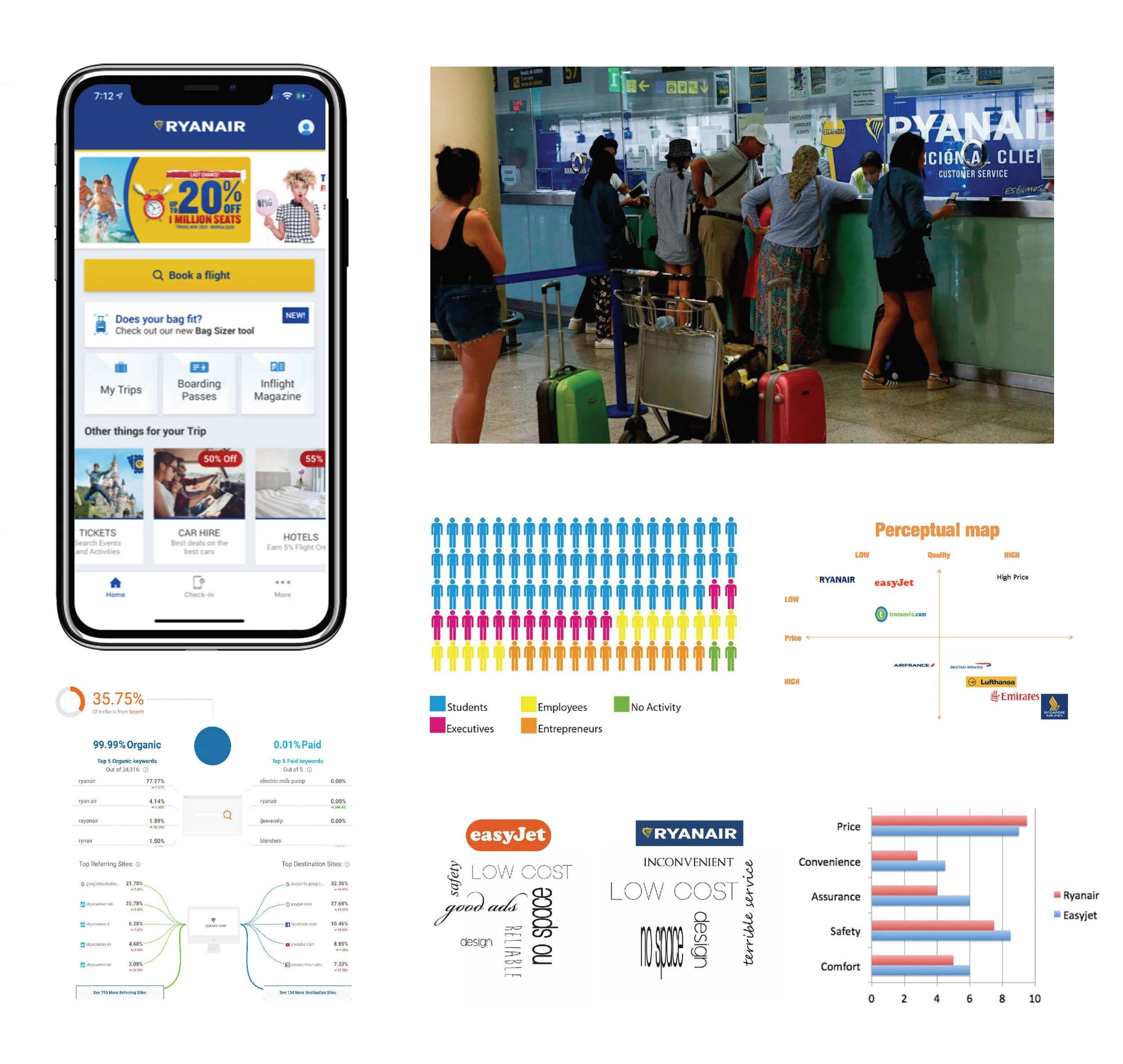
Clockwise from top left: 2019 Ryanair Landing Page, Picture of Customer Service Line (source link), Demo Infographic (source link), Perception and Performance Graphs Between EasyJet and Ryanair (source link), Screencapture from similarweb.com

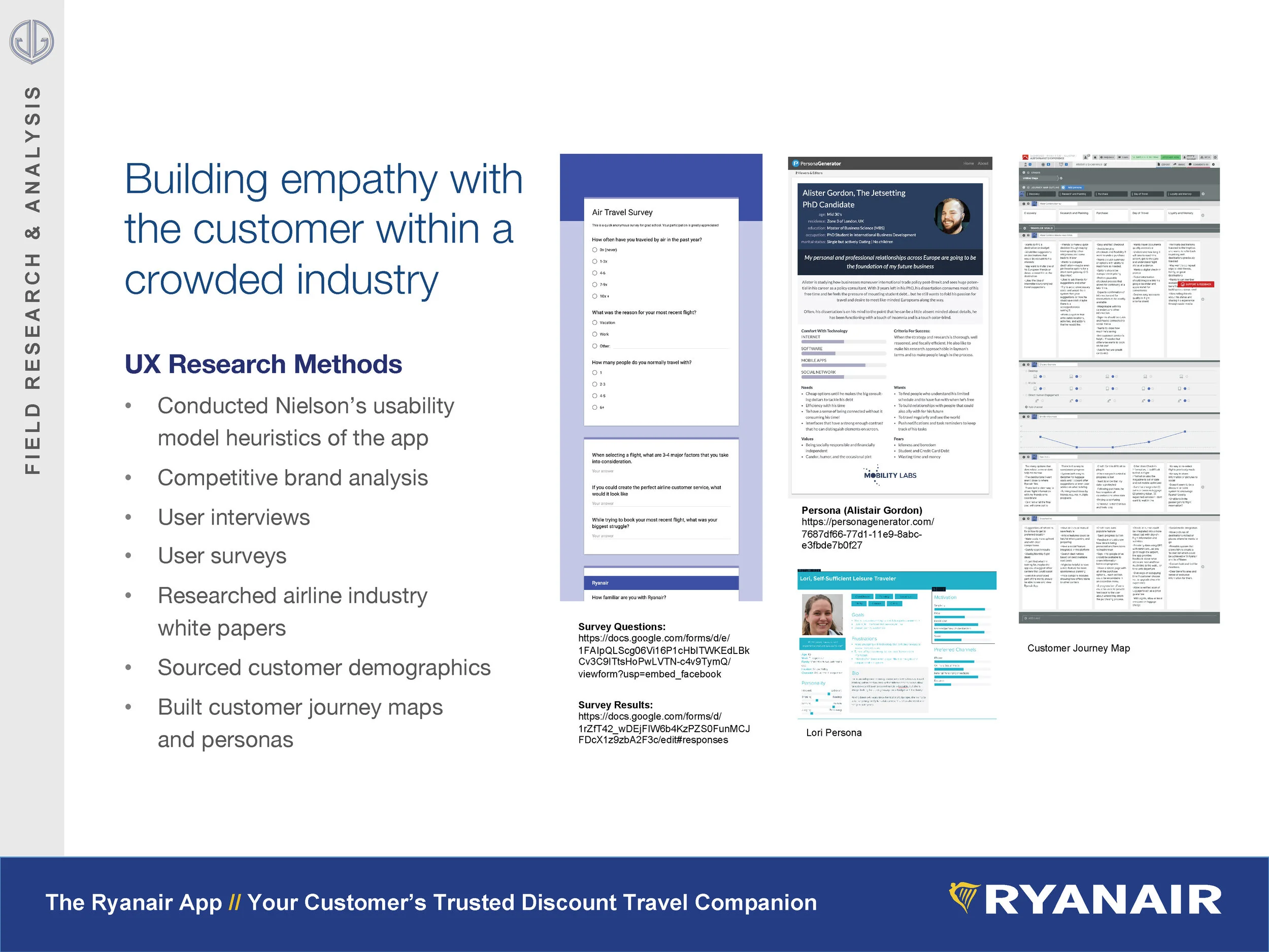
Left to right: Google Forms User Survey: Results, Questions (source link); Persona of Alister Gordon the Jetsetting PhD Candidate (source link) and Lori the Self-Sufficient Leisure Traveler, Customer Journey Map within Xtensio.
Field Research & Analysis
Building Empathy with the Customer Within a Crowded Industry
UX Research Methods:
Conducted Nielson’s usability model heuristics of the app
Competitive brand analysis
User interviews
User surveys
Researched airline industry white papers
Sourced customer demographics
Built customer journey maps and personas
Prioritizing the Opportunities
Referring to Artiom Dashinsky’s book, Solving Product Design Exercises, I decided to conduct a priority assessment of the opportunities that I identified in the customer journey map by plotting the opportunities along a Johari window. This helped to establish a qualitative basis to distinguish the most fruitful approaches for the project.

Click to View Priority List

Thematic groupings
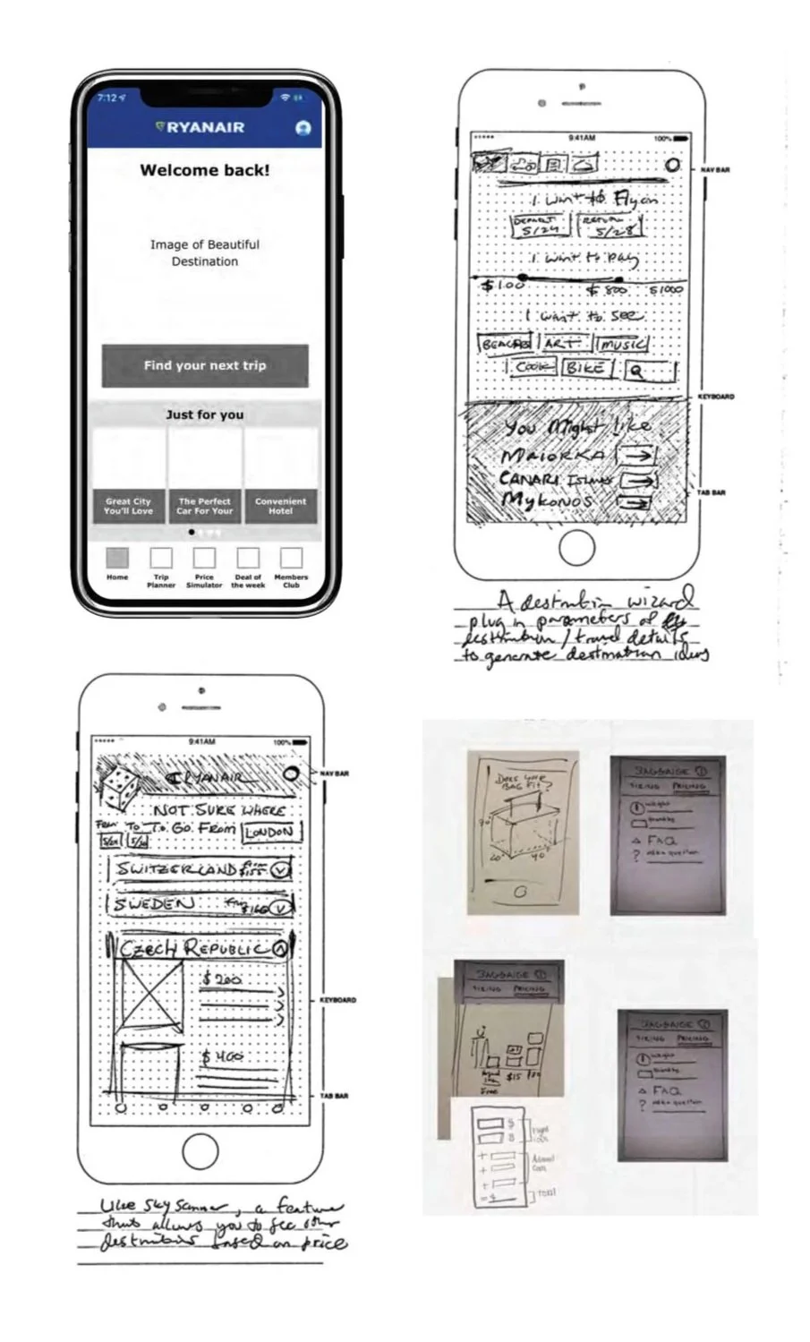
Using a rapid sketching technique, I explored several concepts that touch upon the most promising opportunities derived from research insights. Several themes started to emerge around the following areas:
Expanded flight search functionalities that compares service and pricing with other carriers based on the desired destination
Gamified destination discovery that appeals to the customer with wanderlust and budget constraints
Building trust through price transparency and cost saving tips
Reducing time and effort to checkout using streamlining functions, simplified clicking paths and autofill features

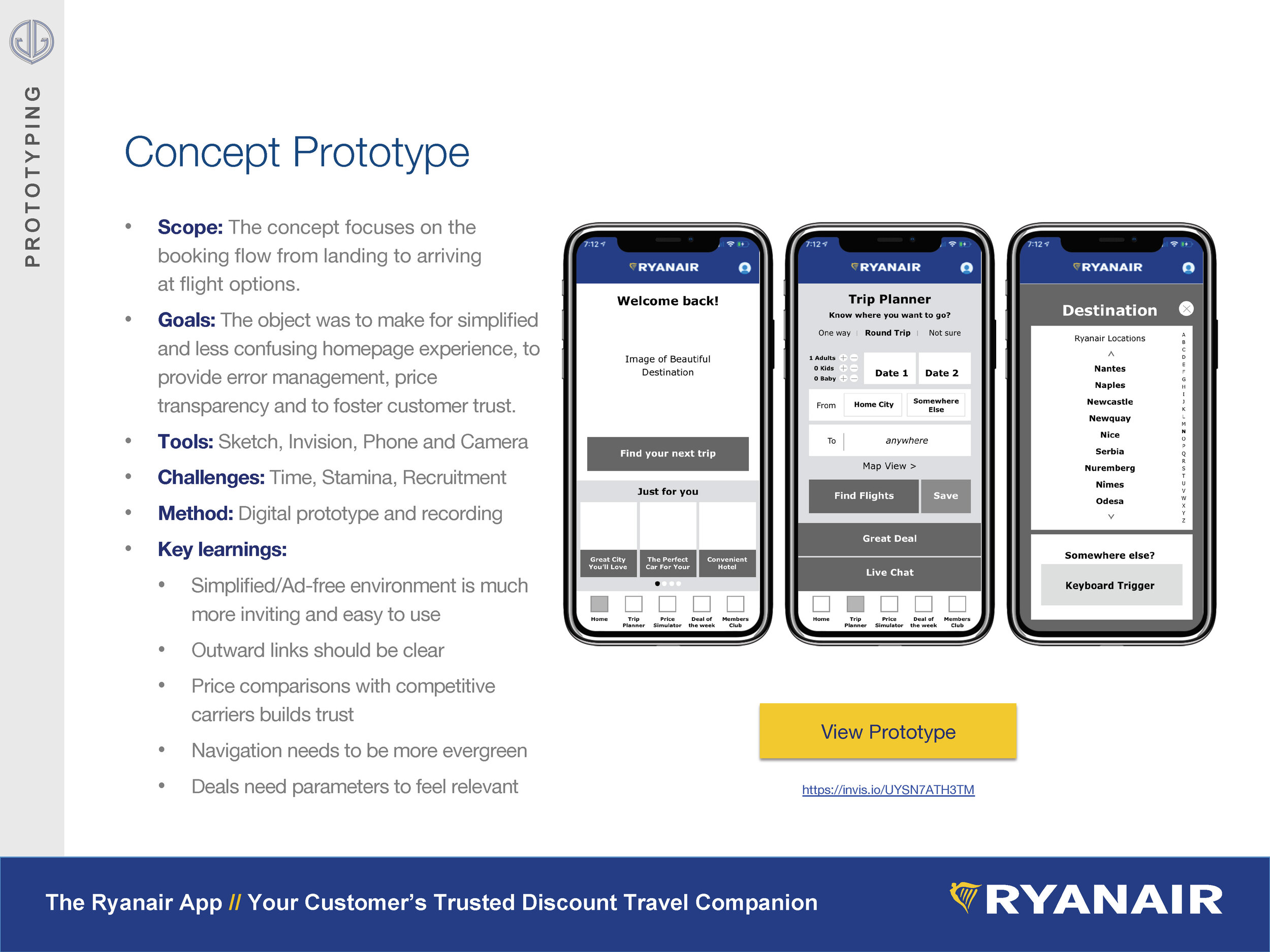
Scope: The concept focuses on the booking flow from landing to arriving at flight options.
Goals: The object was to simplify the confusing current homepage experience, provide error management, price transparency and to foster customer trust
Tools: Sketch, InVision, iPhone and camera
Challenges: Time, stamina, and recruitment
Method: Digital prototype, usability testing and recording
Key learnings:
Simplified/Ad-free environment is much more inviting and easy to use
Outward links should be clear and distinct
Price comparisons with competitive carriers build customer trust
Navigation needs to be more evergreen
Deals need travel and date parameters to feel relevant
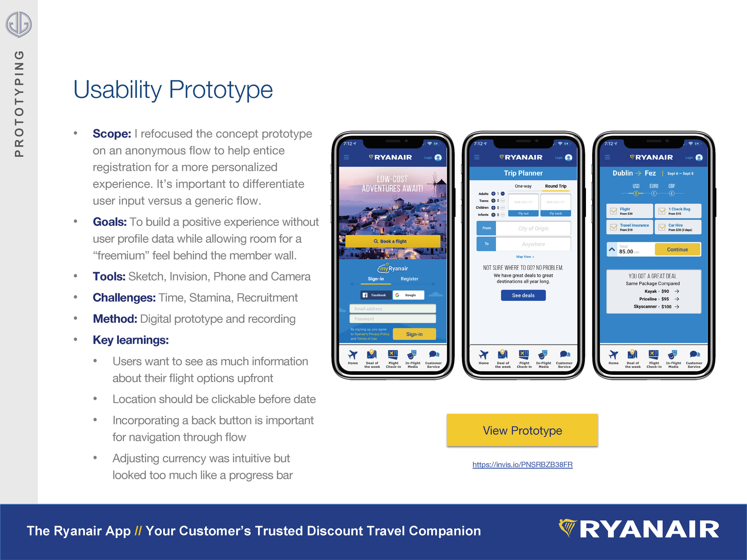
Usability Prototype

Scope: I refocused the concept prototype on an anonymous flow to help entice registration for a more personalized experience. Increasing the user input will help content and itinerary options have greater relevance.
Goals: To build a positive experience without user profile data while allowing room for a “freemium” appearance behind the member wall. This will hopefully increase product trials and raise user propensity to register.
Tools: Sketch, InVision, iPhone and camera
Challenges: Time, stamina, and recruitment
Method: Digital prototype, usability testing and recording
Key learnings:
Users want to see as much information upfront regarding their flight options
Location should be clickable before date
Incorporating a back button is important for navigating through the flow and to give a sense of user control
Adjusting currency was intuitive but looked too much like a progress bar
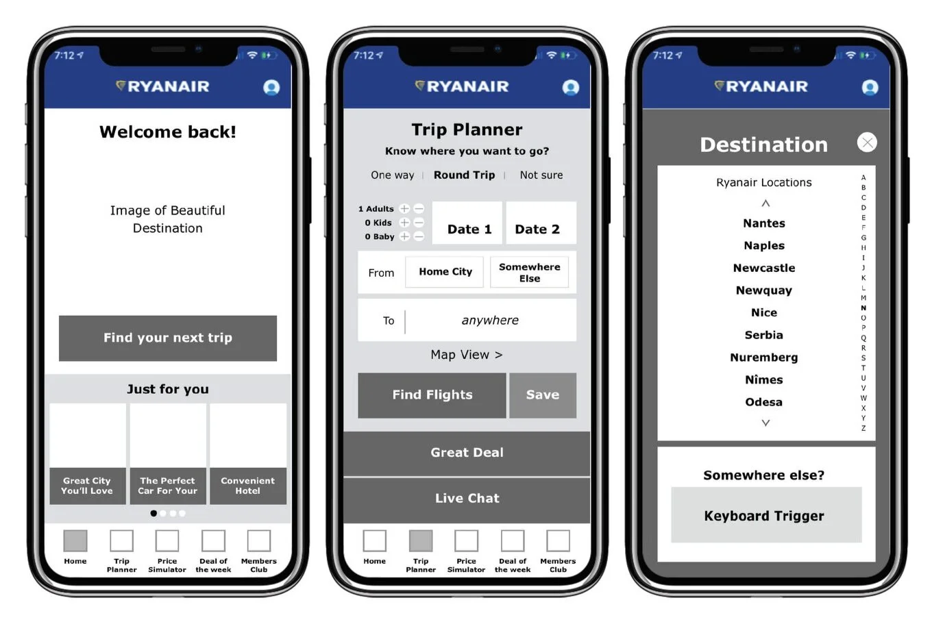
Stakeholder Prototype
Scope: Expanding on the usability prototype as a robust flow and to align the style more closely with the current app.
Goals: I wanted to tighten the look-and-feel of the creative to match with the current app, with exception to the navigation. I was hoping to reduce the amount of direction given during usability tests and to add meaningful transition effects.
Tools: Sketch, InVision, iPhone and camera
Challenges: Time, stamina, and retrofitting edits
Method: Digital prototype and recording
Key learnings:
Using symbols to streamline work
Replacing frames in InVision for efficiency
Testing animations was helpful to see what made sense in the content logic
Color and messaging in the calendar was enough to indicate which date users should choose

Future States
Adjustments to consider for existing stakeholder prototype:
Maybe the country of origin is autofilled or oriented based on the user behind the member wall.
In the price package landing page, should have a way to expand on the details for seat assignments and other details. An accordion dialogue might be worth exploring to accomplish tasks all in one place or have a clear CTA that said “continue for booking details” with a progress bar.
Maybe countries and dots can be integrated together in the same map.
Currency options should be available in the map view.
Longer term additions to the flow (to the right):
Build out a member flow with an adjusted landing experience.
Design a member profile survey for bespoke research results
Design an expandable search area based on country
Integrate a luggage sizing feature and flow information into a pricing calculator
Recorded Presentation
Downloadable: PDF Presentation