
facebook messenger app: Reimagined content architecture
The Problem:
Our consultancy observed the following Human-Machine Interface (HMI) principles that were being violated within the Facebook Messenger app, which we used as a framework to propose to stakeholders:
DISCREPANCY BETWEEN MENTAL MODELS
The expected mental model of usage for the product versus the features it contains.LACK OF SHORTCUTS
The app violates Shneiderman’s 2nd principle “Enable frequent users to use shortcuts” by not providing frequent users with expected shortcutsSETTINGS DISCREPANCIES
The app violates Shneiderman’s 7th principle “Support internal locus of control” by affecting the user’s sense of control of their settings. In addition, Hick’s law is violated because there are too many options for the user to process efficiently
Design Team:
A team of three UX Designers, I was responsible for user interviews, analysis, and collaborated on the prototype and presentation preparation.
What tools you used:
Desk research of the field, In-person interviews, App Heuristics, Sketch, Invision, Powerpoint
Discovery phases:
Sourced customer demographics and app review data
Conducted Shneiderman’s model of usability for heuristics of the app
User interviews
Analysis and Design:
Competitive brand analysis
Annotated user observations
Prioritized tasks based on Nielsen’s Severity Ratings
Lo-hi wireframes and prototypes
A/B Testing
Usability Testing
The final outcome
Although Facebook Messenger is a popular chatting application, our research validated our assumption that users struggle to navigate the app due to confusing labels and shortcuts that do not align with user mind models. Additionally, the “Discovery” tab for both games and business contacts was perceived as extraneous to our test group unless there is a way to personalize the data. Our A/B test revealed that users find that settings and profile data is easier to manage when separated and placed within discrete tabs. We also observed that there is room to elevate the product to make it more accessible for screen readers and for secondary actions such as opening up new chats.


Artifacts

The Challenge:
Violations of Human Machine Interactions were observed which were used as a framework to reimagine the existing interface.
Our team used Schneiderman’s Eight Golden Rules of Interface Design as defining principles to determine opportunities within the app.
Preliminary User Profiles
The team made a hypothesis that social media literacy needed to be considered when conducting interviews. We bucketed potential participants into three groups in terms of tech proficiency, gender, and age.

Screening questions were used during the recruiting process to ensure that participants fit our minimum target qualifications:
Do you have a smart phone?
Do you have the messenger app downloaded to your phone?
Do you have any experience with messaging platforms?
User Interviews
Given resource and timing constraints, we conducted guerrilla interviews with six participants and strived for diversity within the demographics to lower research biases.

Usability Testing Results
Anonymized feedback from the three user groups were parsed into favorable and unfavorable experiences.

User Observations
On Mental Model:
“Didn’t know that you could find games on messenger… didn’t expect that there would be games on the app. Also confused about the function of the game in the chats tab. “Am I messaging the game or playing the game?”
Discover icon is indiscernable—looks like “collagen filled lips”, the other two icons for chats and people were as expected.
None of the ‘popular’ business pages were of businesses that mattered to the user or even had heard of… “not interested in any of these”… same with the sports, entertainment, and news.
Low awareness of the discovery feature or its contents.

Screenshots of Chat Tab (Homepage), Chat Room, and Discover Tab
On Shortcuts:
It is unclear if something is free or not. Users did not want to make accidental in-app purchases.
Friending and chatting features seem to be fairly intuitive, also the calling icon is just as expected.
Deleting messages and other messaging special features (swiping left and right) are not intuitive. They go unnoticed without prompting. Users seemed to expect that there would be features available within the chat environment itself. Abandoned trying to delete messages.
User expects that there would be a new group message button and there would be an “adding” button to select friends.

Screenshots of Sticker Store, Chat Room, and Chat Tab Swipe Left Functionality
On Settings:
Didn’t expect the settings to be found by clicking the image at first but quickly acclimated.
User thinks it’s difficult to find a way to access to settings page and the page is not labeled as settings.
Not a clear way to delete or manage unwanted contacts. User assumed that you only have the ability to block at the individual level rather than from a platform/push notifications level.
User thinks that there are too many inconsistencies between the chat settings and the contact settings and they think that there are too many motions that prompt different actions.

Screenshots of Settings, Avatar Access Button, and Settings Page
Prioritization of User Stories
Tasks were prioritized using the Nielsen’s Severity Rating

Actionable steps
General User Opinions:
Chat section should just be for chat, not games (for example: draw something)
Sub tabs for chatting and playing games
Make sure that the visual language is consistent with Facebook language
Users were confused about their location, didn’t know that they were already in Messenger App
Mental Models:
Settings should have a quick access tab for infrequent users (user recommended we look at WhatsApp)
Discover tab feels extraneous and confusing to the messenger context, also the icon is indiscernable
Separate Games into clear and separate space or tab
Shortcuts:
Make settings accessible in fewer clicks and more obvious
Prioritize based on general frequency. For example: swiping left to get additional settings for a specific chat room that expands to show all functions available
Chat preferences more identifiable specifically for blocking and deleting messages
Group messaging button should be incorporated
Settings:
On settings page, there should be a ‘settings label’
Separate the ‘profile’ and ‘settings’ landing pages
Blocking and deleting should be distinguished
Deleting should be possible on the people page
Findings seem to suggest that it would be less confusing in Facebook and Messenger were integrated
A/B Test for settings tab
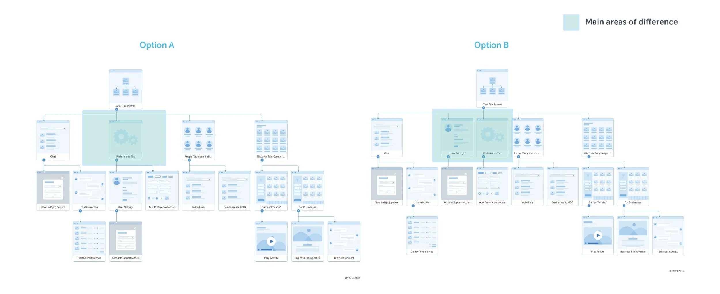
Using the Dix Method for observational usability measures, we were able to A/B test two different solutions in a small focus group.

Dix, A., Finlay, J., & Abowd, G. D. (2004). Human-computer interaction. London: Pearson.
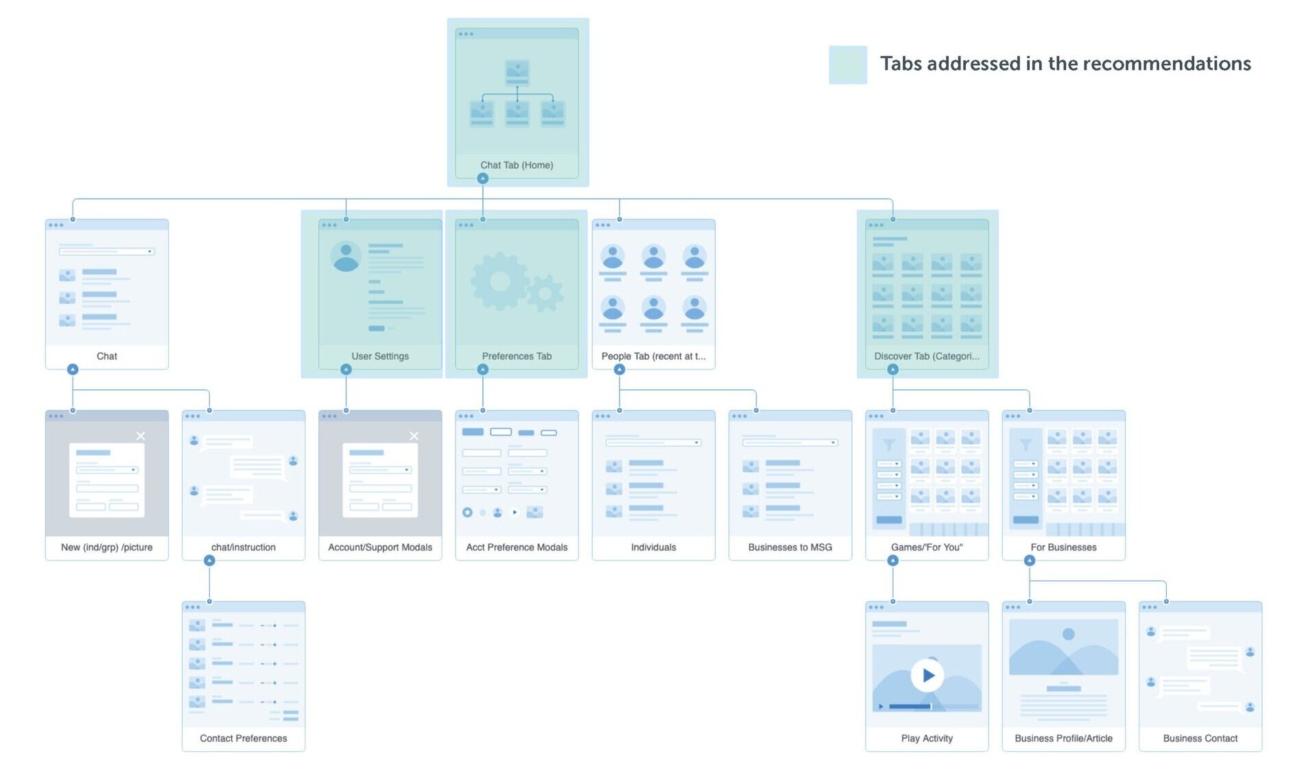
Selected Navigation
During the A/B test, users showed a definitive preference for a clear distinction between User Settings and Profile as seen in option B. Users felt that it was easier to navigate and access their customizable information and mentioned that they like to be able to access settings tabs both quickly and more frequently than preferences.
Recommendations

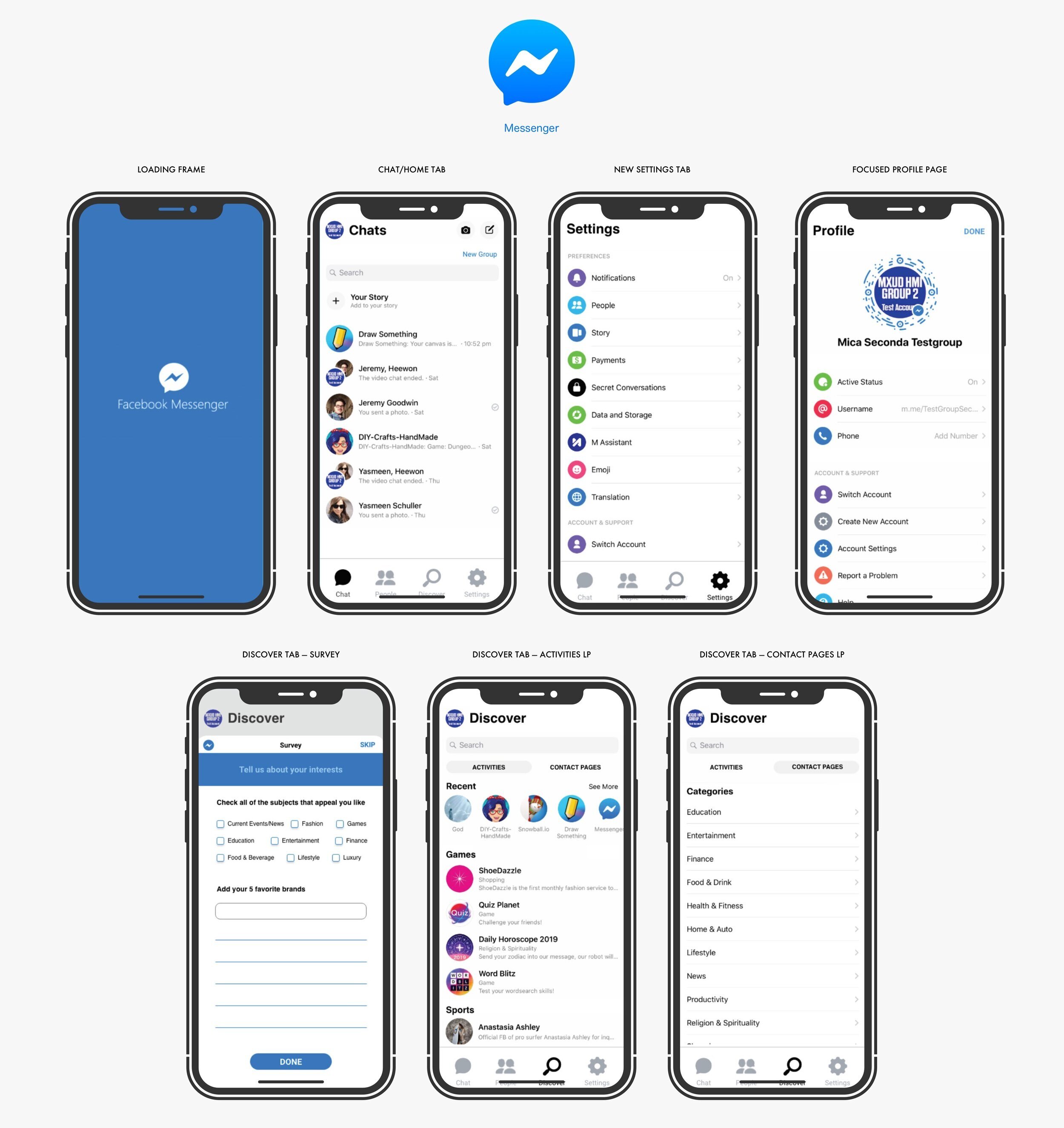
For the Chat Tab:
We added an extended navigation bar at the bottom that now includes a settings tab and for task match we will have a redesigned discover icon. One of our users had previously mentioned that it looked like collagen-filled lips. This was done to better match the user mental model and add additional shortcuts to settings.
Included is a New Group button underneath the New Chat icon per user feedback. This is similar to features on Whats App.
Text was added underneath the main navigation tab so that screen readers have an improved navigational experience.
For the Settings Tab:
We optimized the settings under Hick’s Law by separating the settings tab and the account information.
Settings are accessible via the bottom navigation to optimized based on Fitts’ Law. The profile information is accessible by clicking on the user avatar.
The ‘done’ button was removed from the settings page since the new structure places settings in its own tab. The profile page also looks more usable by making a clear CTA.
A title style was added to pages to clearly identify where users are in the app.


For the Discover Tab:
We referenced similar apps with a Discover function and we arrived at a new solution for the Discover icon
We added a small survey pop-up at the beginning of their discover journey to better cater to the information that was presented to users for relevance. And reorganized the content under Discover and separated into Activities and Contact Pages
Games are under the activities page so that users can understand that they can play a game as opposed to messaging the game company
Sub-tabs and discover survey operate as user affordances to guide the user to ideal task workflow.
Recommending the Addition of a Loading Screen:
We included a brief loading screen with the facebook messenger logo and brand colors to address Shneiderman’s first principle, “Strive for Consistency.”
This approach of utilizing the branding styles is also supported by the Gestalt Law of Similarity that states that “similar elements within a larger stimulus field tend to be perceived as belonging together”. Therefore, users will more likely recognize when they are in the Facebook Messaging App.
Downloadable: PDF Presentation


